
A brand and a website for an electrician starting from nothing
Horizon Hues Installations is one electrician on Vancouver Island. There was no logo, no domain and no website when we started. We built the brand and the site together, and he changes every word on it himself.
The client
Horizon Hues Installations is Eric Pizzingrilli, a licensed electrical contractor working out of Nanaimo across Vancouver Island from Victoria up to Campbell River. Residential, commercial, service repair and EV chargers, and he is the person who quotes your job and the person who turns up to do it.
What they needed
Everything. A new trade business has no logo, no domain, no email on its own name and nothing for a customer to find when they search. It also has the credibility problem every new contractor has: the certifications are hard won, but nobody sees them until they are put somewhere. And the site had to be one Eric could change himself, because he is out of cell service for stretches and cannot be waiting on someone else to fix a typo.
What we built
We built the brand first, then the site around it, and it has been quietly improved since without Eric having to do anything.
The identity, from a blank page
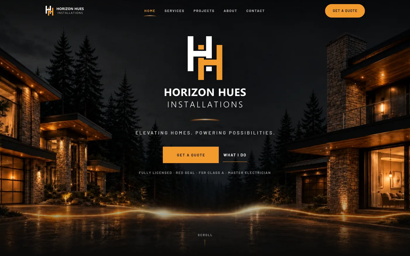
Logo, three concepts, delivered in every format he will need for print, web and vehicle signage. The mark is an interlocking HH that reads as a horizon line, which is where the rest of the site came from. A business card and a reusable invoice template came with it, so the paperwork looks like the website.
Credentials where a customer sees them
Licensed Electrical Contractor, Red Seal, FSR Class A and Master Electrician, all four surfaced in the hero rather than buried on an About page. For a trade nobody can assess by looking, the certifications are the product, so they go above the fold.
A rebuild you cannot see
A few months after launch we moved the site onto the same system the rest of our sites run on, so that when we improve something once, Eric's site gets it too without anyone touching it. The risk with a move like that is the design quietly shifting. We compared the new version against the old one piece by piece instead of trusting our eyes, and kept the original so we could prove nothing had moved. It looks exactly the same, which was the entire point.
He edits it himself, in the browser
Eric signs in with a code emailed to him, then clicks any words on the live page and retypes them. No dashboard, no password to lose, no ticket to us. Because the editor is shared across every site we run, a fix made once reaches his site too.
Design notes
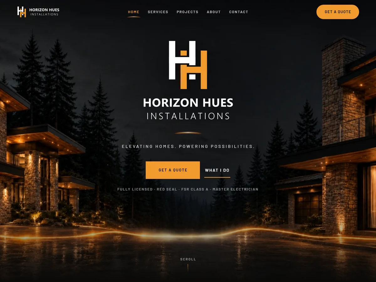
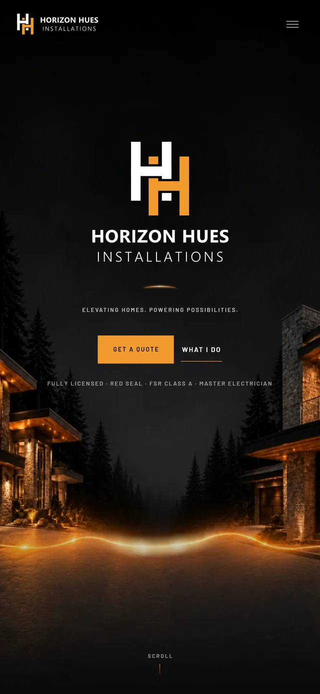
Electrical work happens in the dark and the sell is confidence, so the site is near black with a single amber accent and almost nothing else. The hero is a Vancouver Island treeline at dusk with one glowing line running along the horizon, which is the logo mark drawn at full width. Restraint is the point: a trade site that shouts reads as a franchise, and Horizon Hues is deliberately one person.
The result
3 logo concepts
drawn from scratch, and the one he picked is his to keep in every format he will need
4 certifications
the tickets that took years to earn, now the first thing a customer sees
100%
of the words on the site, changed by Eric himself without calling us
A new electrical contractor that looks established from the first search, with a brand he owns outright and a site he can change from a job site. The certifications that took years to earn are now the first thing anyone sees.
Want a site like this for your business?
Every project is quoted up front, based on what your business actually needs. It starts with a conversation, and the quote is free.